移动端仿APP下拉刷新效果
因,闲的无聊,在好奇,忐忑,彷徨,纠结,无奈的情况下点进了某宝,看见他们家的APP还不错,下拉刷新挺有意思的。于是乎思索一番写下这篇技术实现
实现步骤和思路:
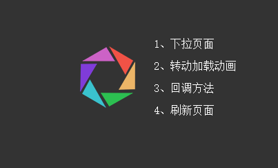
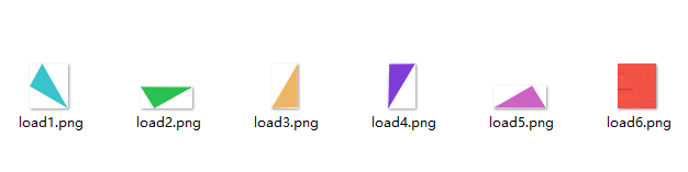
1)事先准备素材,我把彩色圈圈切割成了不同的色块图,最后拼凑起来的。
2)之后用定位的方法把图片位置拼好,这是个细活儿,要有耐心。
之后就是技术重点,如何让它动起来,而且是根据手势的拖动去执行相应的操作。
首先先确定几个基本点:
a、手指必须是按下-》拖动-》松开,并且是从上往下拖才算完成一套动作,并触发事件。
b、当前页面必须已经到了最顶部才能触发该事件,否则只做普通滚动处理。
c、往下滚动不执行任何事件,并且注销之前已有的事情。
d、拖动距离小于40,只执行过程动画,不执行结果事件(包括转动效果)
e、拖动距离大于40但手指仍未离开屏幕,导致手指离开屏幕时开始点与结束点距离小于40,也按d项处理
其次再来列技术点:
a、触摸touch事件(start,move,end)
b、动画事件(animation,transition)
3)具体实现,看代码
先定义一个全局拖动方法,我这里是把body当作触发的对象
<script type="text/javascript">
Cf.action = function(bos,a,b){
    bos.style.MozTransform = bos.style.OTransform = bos.style.MsTransform = bos.style.msTransform = bos.style.webkitTransform = bos.style.transform = 'translateY(' + a*b + 'px)';
}
</script>
然后编写手指按下,拖动,松开的连贯事件
<script type="text/javascript">
bo.on("touchstart",function(event){
    event.stopPropagation();
    //获得起始点
    T.sY = event.originalEvent.changedTouches[0].pageY;
});
bo.on("touchmove",function(event){
	//移动过程捕捉
    T.eY = event.originalEvent.changedTouches[0].pageY;
    T.lY = (T.eY - T.sY)/5;
    //判断当前是最顶端,并且往下滑动
    if(w.scrollTop()==0 && T.lY>0){
        event.preventDefault();
        event.stopPropagation();
        Cf.action(bos,1,T.lY);
        Cf.posistart(T.lY);
    }else{
        Cf.endd();
    }
});
bo.on("touchend",function(){
    event.stopPropagation();
    if(w.scrollTop()==0 && T.lY>0){
        bo.removeClass("transition-die");
        Cf.action(bos,1,0);
        //如果距离小于40则不执行结果
        if(T.lY<40){
        	Cf.posiend(false);
        }else{
        	Cf.posiend(true);
        }
    }
    $this.removeAttr("style");
});
</script>
最后定义开始,结束,注销事件
<script type="text/javascript">
Cf.endd = function(){$($this).off().removeAttr("style")}
Cf.posistart =function(p){
    Top.addClass("transition-die").removeClass("hide").css("top",(-p/5-80)+"px");
    Top.find("span").each(function(index, el) {
        var bottom = parseInt($(this).attr("data-sum"));
        var ind = $(this).index();
        $(el).addClass("transition-die").css("bottom",bottom-(ind*p)/1.1+"px");
    });
}
Cf.posiend = function(o){
    if(o){
    	Top.removeClass("transition-die").animate({"top": "-20px"}, .2,function(){
	        var t1 = setTimeout(function(){Top.addClass("loadingc"); clearTimeout(t1)},200);
	    });
	    Top.find("span").each(function(index, el) {
	        var ind = $(this).index();
	        $(el).removeClass("transition-die").css("bottom",po[ind]+"px");
	    });
    	t2 = setTimeout(function(){
	        Top.animate({"top":"-80px"},300,function(){
	            Top.removeClass("loadingc");
	            if(callback){callback()}
	        });
	        clearTimeout(t2);
	    },1500);

    }else{
    	Top.css("top","-80px").removeClass("loadingc");
    	Top.find("span").each(function(index, el) {
	        var ind = $(this).index();
	        $(el).removeClass("transition-die").css("bottom",po[ind]+"px");
	    });
    }
}
</script>
最后附上样式文件
<style type="text/css">
* {
	padding: 0;
	margin: 0;
	box-sizing: border-box;
}
html{
	background: #333;
}
body{
	background: #fff;
}
html,body{
	min-height: 100%;
}
p{
	text-align: center;
	padding:50px 0;
}
/*注册动态事件*/
.transition {
	-webkit-transition: all .3s ease 0s;
	transition: all .3s ease 0s;
}
.transition-die {
	-webkit-transition-duration: 0s !important;
	transition-duration: 0s !important;
}
/*loading模型*/
#top {
	width: 80px;
	height: 90px;
	position: absolute;
	top: -80px;
	left: 50%;
	margin-left: -40px;
	transform: scale(.3) !important;
	-webkit-transform: scale(.3) !important;
	z-index: 999;
}
#top span {
	position: absolute;
	background-position: center;
	background-repeat: no-repeat;
	background-size: 100%;
}

#top span.load1 {
	width: 35px;
	height: 41px;
	background: url(load1.png);
	bottom: 1px;
	left: 3px;
}

#top span.load2 {
	width: 47px;
	height: 20px;
	background: url(load2.png);
	bottom: 3px;
	right: 3px;
}

#top span.load3 {
	width: 24px;
	height: 41px;
	background: url(load3.png);
	bottom: 27px;
	right: 0;
}

#top span.load4 {
	width: 25px;
	height: 41px;
	background: url(load4.png);
	bottom: 24px;
	left: 0;
}

#top span.load5 {
	width: 48px;
	height: 21px;
	background: url(load5.png);
	bottom: 68px;
	left: 3px;
}

#top span.load6 {
	width: 35px;
	height: 41px;
	background: url(load6.png);
	bottom: 49px;
	right: 3px;
}
/*转转*/
.loadingc {
	-webkit-animation: loadingc linear 2s  infinite;
	animation: loadingc linear 2s  infinite;
}

@-webkit-keyframes loadingc {
	from {
		-webkit-transform: rotate(360deg) scale(.3);
	}

	to {
		-webkit-transform: rotate(-360deg) scale(.3);
	}
}

@keyframes loadingc {
	from {
		transform: rotate(360deg) scale(.3);
	}

	to {
		transform: rotate(-360deg) scale(.3);
	}
}
</style>